

This time we will discuss about CSS Shadow, if you remember a few years ago, when they want to create a shadow effect on the website, so we have to make it in photoshop using the Drop Shadow effect, then we crop / slicing as needed.
Wow, ya bother? what are the results form an image file, which can be burdensome website, the website can add to the burden of having to load the first image to a shadow.
Currently those days had practically ended, though not entirely ended. Shadow on the website can be created by adding a few lines of CSS3 only.
CSS Shadow working principle is as follows :
box-shadow: none | <shadow> [ , <shadow> ]*

<shadow> = inset? && [ <length>{2,4} && <color>? ]
We can see that the shadow separated by a comma (,) and every comma is used to provide vertical or horizontal and shadow, wide on the thicknessExample such as the following:

Syntax like this :
.example {
 box-shadow: 10px 10px 5px #888;
}
but sometimes we need an additional prefix if you want to apply css in Firefox and Safari, because of differences in their engines. So the above script should be written like this:.example {
-moz-box-shadow: 10px 10px 5px #888;
-webkit-box-shadow: 10px 10px 5px #888;
box-shadow: 10px 10px 5px #888;
}Here are some examples of pieces you can use shadow :.example_1 {
box-shadow: -5px -5px #888;
-moz-box-shadow: -5px -5px #888;
-webkit-box-shadow: -5px -5px #888;
width:300px;
background:#f4f4f4;
padding:10px;margin:10px
}
.example_2 {
box-shadow: -5px -5px 5px #888;
-moz-box-shadow: -5px -5px 5px #888;
-webkit-box-shadow: -5px -5px 5px #888;
width:300px;
background:#f4f4f4;
padding:10px;margin:10px
}
.example_3 {
box-shadow: -5px -5px 0 5px #888;
-moz-box-shadow: -5px -5px 0 5px #888;
-webkit-box-shadow: -5px -5px 0 5px#888;
width:300px;
background:#f4f4f4;
padding:10px;margin:10px
}
.example_4 {
box-shadow: -5px -5px 5px 5px #888;
-moz-box-shadow: -5px -5px 5px 5px #888;
-webkit-box-shadow: -5px -5px 5px 5px#888;
width:300px;
background:#f4f4f4;
padding:10px;margin:10px
}
.example_5 {
box-shadow: 0 0 5px #888;
-moz-box-shadow: 0 0 5px #888;
-webkit-box-shadow: 0 0 5px#888;
width:300px;
background:#f4f4f4;
padding:10px;margin:10px
}
.example_6 {
box-shadow: 0 0 5px 5px #888;
-moz-box-shadow: 0 0 5px 5px #888;
-webkit-box-shadow: 0 0 5px 5px#888;
width:300px;
background:#f4f4f4;
padding:10px;margin:10px
}
HTML Syntax :<div class="example_1" >This is an example 1 of CSS Box Shadow</div> <br/> <div class="example_2" >This is an example 2 of CSS Box Shadow</div> <br/> <div class="example_3" >This is an example 3 of CSS Box Shadow</div> <br/> <div class="example_4" >This is an example 4 of CSS Box Shadow</div> <br/> <div class="example_5" >This is an example 5 of CSS Box Shadow</div> <br/> <div class="example_6" >This is an example 6 of CSS Box Shadow</div>

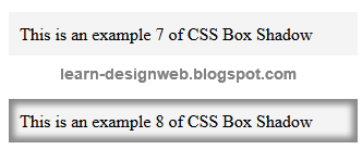
In the shadow
If you want to create a shadow was on the element, then use the insert. For example is :
.example_7 {
box-shadow: inner 0 0 5px #888;
-moz-box-shadow: inset 0 0 5px #888;
-webkit-box-shadow: inset 0 0 5px#888;
width:300px;
background:#f4f4f4;
padding:10px;margin:10px
}

.example_8 {
box-shadow: inset 0 0 5px 5px #888;
-moz-box-shadow: inset 0 0 5px 5px #888;
-webkit-box-shadow: inset 0 0 5px 5px#888;
width:300px;
background:#f4f4f4;
padding:10px;margin:10px
}
HTML Syntax :<div class="example_7" >This is an example 7 of CSS Box Shadow</div> <br/> <div class="example_8" >This is an example 8 of CSS Box Shadow</div>
Multiple Shadow
We can also apply multiple effects to a single element of shadow objects by providing a comma (,).
.example_9 {
-moz-box-shadow: 0 0 10px 5px black, 40px -30px lime, 40px 30px 50px red, -40px 30px yellow, -40px -30px 50px blue;
-webkit-box-shadow: 0 0 10px 5px black, 40px -30px lime, 40px 30px 50px red, -40px 30px yellow, -40px -30px 50px blue;
box-shadow: 0 0 10px 5px black, 40px -30px lime, 40px 30px 50px red, -40px 30px yellow, -40px -30px 50px blue;
width:300px;
background:#f4f4f4;
padding:10px;margin:10px
}
HTML Syntax :<br/><br/> <div class="example_9" >This is an example 9 of CSS Box Shadow</div> <br/><br/>

Done already discussion about CSS Shadow. You can implement it on your website and blog


0 komentar:
Posting Komentar